site colors and feel.
may 29th, 2026
i wanted to talk about the site feel and where it came from as a lot of thought and consideration went into the choices.
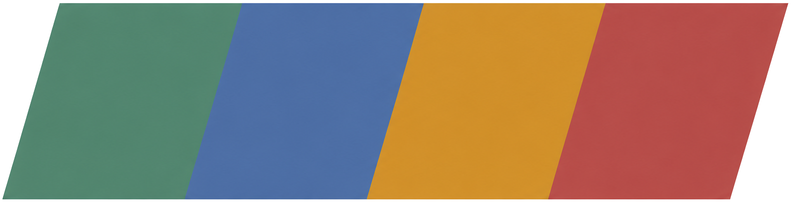
first is the colors. together titled “City Pop Cartridge”
green: #4D8470 (matcha)
blue: #5574A3 (indigo)
gold: #C08C32 (brass)
red: #A95245 (brick)
i think the colors evoke a feeling of a Super Nintendo in the accent colors, while achieving a classic 90s pc monochromatic feel across the foundation. i wanted it to feel like a mix of formal and strict and playful and nostalgic. the monochromatic base keeps the site in a focused state between charcoals and mild tan. however, i thought it felt a bit TOO austere, so adding in some color was an important step. deciding the colors was something i had landed on years ago. ive always enjoyed the look of primary colors over monochrome, its also the way i dress myself. i specifically wanted to play off the Super Famicom/ Super Nintendo’s button colors. i always thought the palette was the right balance of playful and serious… and so very very japanese. my largest struggle has been keeping a certain identity throughout the site, not too bland, not too fun. i want the site to be well respected and non-intrusive to the wide swath of future visitors, but memorable enough that anyone will think of these four colors when they think, inevitably, of “The Sagasu Review.”
Green, Blue, Yellow, Red.
accent colors should be a strong undercurrent of the identity, but not so much that they spill over into the primary focus. the balance is keeping them in the background, but ever present across the site.
i probably wont decide on a font until july, or a year from now. serif. sans-serif. standard. bold. lord help me!
right now, i like the bold heading fonts. it feels a bit too playful, yes, but i think it feels quietly more japanese. i’m not trying to be a japanese website, but the homage helps tie the site with its original purpose. japanese music reviews. that’s why we are here. japan is filled with gorgeous, powerful, confident and bold font-styles. i think they really soar when in kanji, exploding over billboards, roadwork, store-fronts, grocery labels, beer cans. bold font work is so wonderfully present in japanese society, i think it important to lean into that. primary colors, strong identity, bold text all feel very “nihon.”
the rest of the site i want easily readable and easily accessible. review pages are sparse and uniform. navigation is clear and distinct. the home page is deliberately simple. i’ll admit i’m tired of overcrowded websites and unclear site progression paths. they’re a product of a world trying to do too much, in a world where people are tired of being asked to do too much. a website should feel idiomatic. just how i like my coffee.
lastly, i want to mention “Sago the penguin.” haha! it just felt so right to have a small mascot. there’s a more serious music review site out there (lots), and they can NOT have a mascot, if they want. i want one. i think he adds a ton of personality and a touch of joy to the website. i am tired of the world needing to be cool, needing to be sexy, needing to be soulless, needing to be all the same. the site colors and Sago are a rebellion against this tired presentation. a website can be informative, serious, passionate, fun and enjoyable all in one place. that is The Sagasu Review. informative pieces, serious layout, passionate writers, fun visuals and an enjoyable experience. that’s probably my thesis for the site on a whole. top to bottom.
anyways, for all the serious and the goofy, that’s the site’s identity. i hope it works for you and your personal enjoyment!
sincerely,
Marcus Landeros
Editor-in-Chief, The Sagasu Review
currently listening: Anri — Shyness Boy